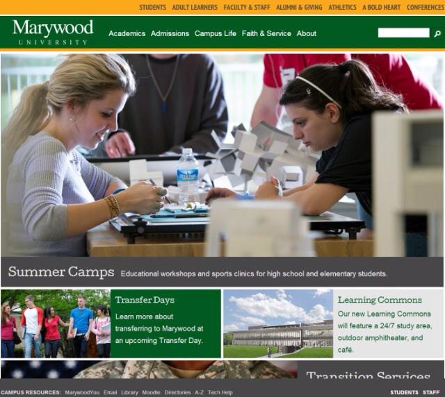
Marywood website gets facelift
July 19, 2014
Marywood’s web developers have made some major changes to the university’s website.
The web team, which consists of Sr. Kathleen Burns, director of web development, Mark Pitely, web developer, Amy Fedele, web design specialist, and Todd Pousely, web content director, have been working on the redesign since May of 2013 and it officially launched on July 8th.
“The use of smart phones and tablets become more prominent,” said Fedele. “The way our site used to be set up only allowed a small amount of information to be viewed on a smart phone. The information did not parallel our actual website in navigation or detail, and we wanted to bridge this gap to give a more uniform experience to our users,” said Fedele.
The inspiration for the new website design came from a trend called cards. An example of this design is the popular website Pinterest.
“In order to make the pages functional across every device and form factor, we had to stop thinking in the paradigm of columns and rows. Blocks seemed a good compromise,” said Pitely.
The website was also designed to be more user-friendly.
The web team used years of data to see what people looked for and clicked on most. They used that information in choosing the links that appear in the menus of the header and footer section.
Email has also become a “one-click experience,” according to Pitely.
“That alone will save our users over a million clicks a year,” he said.
Despite the fact that the website redesign has taken place during the middle of summer, students are already taking notice.
“I noticed the website had changed and at first I had some difficulties finding where everything was but the layout is great and very appealing to the viewer,” said Amy Hubbard, sophomore nursing major.
Throughout the duration of the redesign, the web team worked closely with Marketing, Admissions, and other various departments to make sure that each group was being properly represented in the new design.
“The web is a constantly changing place, and many of the decisions made in the old design, and technologies available at the time, have altered. In order to take advantages of new features, we had to move forward,” concluded Pitely.


